| ProductCode | : | Hp-Moc-1 |
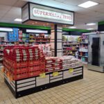
| Categories | : | Market Tools, New Market Stalls, Supermarket Pulses Display Stand |
| Contact | : | +90 ( 535 ) 363 96 79 |
Special Shelves in Markets
Special designs in supermarkets aim to enhance the shopping experience for customers and boost sales. These designs are strategically used to organize the store layout, present products attractively, and direct customers to specific areas. Here are some common design elements used in supermarkets:
1. Layout and Flow
- Eye-level placement: The most in-demand and high-margin products are placed at eye level. For example, in the fruit and vegetable section, fresh, bright, and colorful products are prominently displayed.
- Circular flow: Customers tend to turn right, so the store layout is often designed to follow this behavior. A circular flow is also created from the entrance to the exit, ensuring customers pass through all sections.
- Special areas: Seasonal products, promotional items, or organic products are often displayed in designated sections of the supermarket.
2. Lighting
- Accent lighting: Especially in fresh food sections, lighting similar to natural light is used to make fruits and vegetables appear fresh and appealing.
- Ambient lighting: To create a relaxing atmosphere and encourage customers to shop, soft and warm lighting tones are preferred.
3. Color and Decoration
- Color psychology: Different colors can influence customers’ shopping behavior. For example, green and yellow tones symbolize freshness and nature and are often used in the fruit and vegetable section. Red, a color that grabs attention, is frequently used in promotional areas.
- Natural materials: Wood, stone, or natural-looking decorative elements are commonly used in areas with organic products or themes like “farm-to-table.”
4. Aroma and Music
- Pleasant scents: Supermarkets often use the scents of freshly baked bread, coffee, or fresh fruits to encourage customers to spend more time shopping.
- Background music: Soft and calming music during shopping enhances the customer experience and can increase the time they spend in the store.
5. Visual Presentation and Shelf Arrangement
- Pyramid arrangement: Especially in the fruit and vegetable section, products are displayed in a pyramid shape to suggest abundance and increase attractiveness.
- Different heights: Products are placed on shelves at varying heights to capture customers’ interest and avoid monotony.
6. Digital Screens and Interactive Panels
- In modern supermarkets, digital screens are often used to provide additional information, such as product features, recipes, or health information. Interactive panels allow customers to instantly access nutritional information or price comparisons for specific products.
7. Special Areas
- Gourmet products: In sections where luxury and specialty products are displayed, stylish shelves, showcases, and design elements are often used. These areas may feature products like wine, cheese, or handmade chocolates.
- Organic or local products: Areas with organic or regional products are often decorated with eco-friendly elements and are highlighted in a special way.


